In late July, my girlfriend and I were making our way back down the east coast from Maine to Florida, and on the day we drove from Delaware to Washington D.C., some lane blockage on the Chesapeake Bay bridge kept us in Maryland for a little longer than we intended. As we sat in our Subaru over the bay, Paige and I had a silly, albeit heated disagreement about the goodness (versus badness) of the Maryland flag. At the time, all I could really think to say for its merit was that it was "a state flag done right.” The purpose of this post is to explain in more detail why that Maryland flag is a shining example of good vexillography and to generally shed some light on why it is one of my favorites.
Alright, first we’ll talk specs, or why it is a good flag, technically speaking. And we’ll start fresh. No child left behind. The principles of good flag design are as follows:
Keep It Simple. The flag should be so simple that a child can draw it from memory.
Use Meaningful Symbolism.
Use 2 or 3 Basic Colors.
No Lettering or Seals.
Be Distinctive or Be Related.
I’ll admit. If you asked a kid to draw this flag, you might get two crosses and a checkered pattern; hopefully red, white, yellow and black each make an appearance somewhere. That one’s a stretch.
But this flag is full of meaningful symbolism. I’ll try to keep it brief.
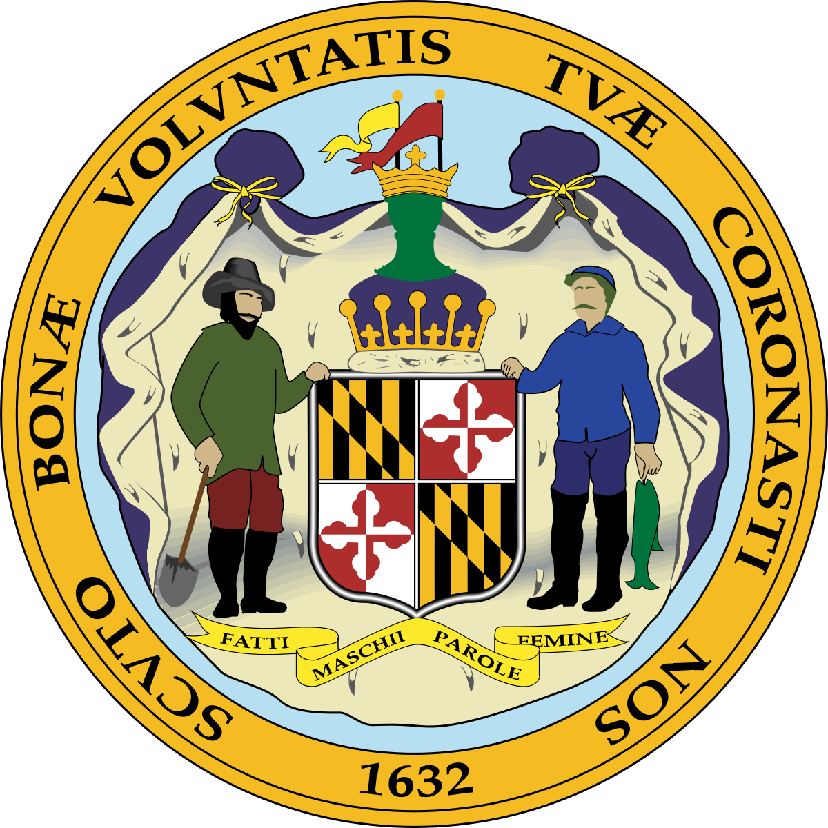
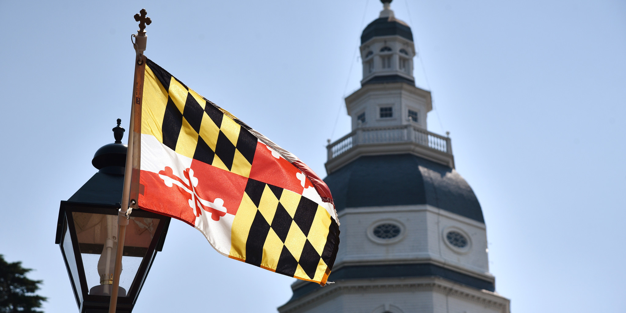
The pattern that appears on the flag is derived from the coat of arms of George Calvert, the first Baron Baltimore (He colonized the area). The yellow and black pattern was given to him as a reward for his bravery when he stormed a fort. The red and white pattern came from the Crossland coat of arms, that of his mother.
Of course, the coat of arms is not actually represented like it is on the flag. It is featured in its true form on the Seal of the State of Maryland.
This is the part that makes this flag stand out. US state flags often feature the state seal pasted on blue or white. These flags are called SOBs (Seals On Bedsheets), and there are 30 of them! Seriously! Look it up. I checked. And seal or no seal (not the game show), 38 state flags incorporate text!
The flag of Maryland however features the seal’s strongest aspect front and center, as the whole flag. The colors are simple and bold. Red, yellow, black and white. And don’t you dare tell me “that’s four colors!” No it’s not. Black and white are not colors. That’s two. And what good colors at that. Red and white contrast really nicely, and black and yellow the same.
The flag doesn’t feature any lettering, either. If the Maryland flag followed the general rules of state flag design, it would probably look something like this:
or maybe even this:
I know…ew.
Instead, the flag of Maryland looks like this:
Glorious and badass, simultaneously and at the same time.
It’s actually a very European style of vexillography. A similar design process was used for the flag of Amsterdam, the most badass city flag in the world.
So your kid can’t draw it. Fine.
Hell, I probably can’t draw it. Fine.
But this flag is distinct. No name tag needed. You can see it up close. You can see it from afar. And what a cool thing to see. Nothing about this flag is boring.
But let’s look past the technicalities. What’s it like in the wild?
This flag is a bold flag. And as an avid sports-aesthetic-noticer, I have seen this flag featured in various subtle and not-so-subtle field capacities on the field of play, as a form of state and/or civic pride.
On the one hand, you have the sleeve patches featured on both the Orioles’ and Ravens’ uniforms.
Subtle, right? Nice little detail. What a cool way to acknowledge where you’re from!
And on the other hand, you have the University of Maryland.
Now, I get that the flag’s colors look a little strange on the Orioles’ orange. And I get that nothing looks good on purple because purple’s a shitty color. But the University of Maryland, with the flag they had, decided that was all they needed. They took an awesome color combination and created my favorite flag-based uniform ever. So distinct. So bold. It’s so much, yet so clean. The jersey shouldn’t even say “Maryland." We know who you are, UM.
Here’s another one. I don’t know how many times I’ve seen this sticker:
Not just in Maryland, either. Everywhere.
It’s a bit much for my taste, but that’s not the flag's fault. It has, after all, been forced into the tiny legs of a crab. Good luck with that. But the fact that this sticker pops up so much is a testament to the flag’s success. If Maryland had a shameful flag like those we discussed previously, their stickers would look like this:
Like every other sticker ever. Whatever. It’s been done. It’s boring.
In the end, a good flag is one that is distinct and that inspires pride in its people. That is the job of a flag. In Maryland I see both.
That said, this is the line:
Don’t cross the line.


