Hey, I’m Baylor. I love sports. Specifically, I love baseball and Ultimate. Even more specifically, I have always been obsessed with athletics aesthetics. I grew up designing baseball jerseys on index cards, and as I grew older and began playing ultimate in high school, I applied my uniform obsession to the disc sport. In 2015, I started watching professional ultimate. As the sport continues to grow, I continue to watch its aesthetics develop. Now, with the AUDL championship weekend approaching, I thought it would be a great time to go over all of the AUDL’s many uniforms, good, bad, and ugly. So let’s get into it.
The AUDL (American Ultimate Disc League) played its inaugural season in 2012 with eight teams. In April of 2017 it entered its 5th season, now encompassing 24 teams which scatter the continental United States and Canada. To give you an idea of what we’re working with, Ultimate uniforms are a set of shirt and shorts, loose-fitting to allow flexibility. The official uniform supplier of the AUDL is Boon Ultimate, who makes light and breathable uniforms, thanks to the process of jersey sublimation. Sublimation allows almost any image to be transferred into the very fabric of the apparel. Cool, right?
Well…it is cool, it’s just made it possible for some teams to commit crimes of "uni-versal” proportion. From this moment on, this is my review of the field of 2017 AUDL kits. I tired to find pictures of the uniforms in action. For teams that didn’t have any good pictures, I just used the pictures they used in their stores. Sorry for the inconsistencies. Also, this is not in ranking-order. I’m going alphabetically. Starting…now!
Atlanta Hustle
That’s the home kit on the left, road on the right.
Honestly, I kinda like these. I am really not a fan of the color purple as a team color, but the use of purple here, setting off the black and the white alike, I think it looks cool. The number font is consistent, and the big, bold HUSTLE on the home kit’s chest is simple and intimidating. Well done. The red stripe on the road jersey is a nice touch as well.
Austin Sol
Home left, road right.
I honestly can’t say too much about these. I love them. Blue and orange are great together. I love the orange stripes on the home sleeves and the blue road sleeves. A cool insignia has been appropriately adapted for play at home and on the road. I also want to add that the player on the left coordinated his socks and cleats very well. That’s unusual in ultimate. Nice touch.
Chicago Wildfire
Home left, road right.
The good: I love the Chicago flag on the sleeve. Every Chicago team should adorn a jersey or 3 with that beautiful flag. I actually like the font.. Looks like a fire and rescue font. Which makes some sense, given Chicago's history, fire-wise. Also, cool nod to the sears tower. Which brings us to the…um…"room for improvement” section.
Wildfire should be the big word. But the way it sort of looks like “Wildfire Chicago” rubs me the wrong way. And like I said before, blue and orange are great colors together. But I kinda wish they were blue and red. The flag is blue and red, and so are the Cubs. I just think it would have been a nice nod to the hometown. But overall, this is still one of the better looks.
Dallas Roughnecks
Home left, road right.
The home jersey this year are a huge improvement over last year’s, in my opinion. It’s still a lot going on, at least on the back. But at least it’s only two colors now. And honestly, the oil rig as a continuation of the homage to Texas’ oil history is a great addition. The road jerseys are similarly cool, keeping the chest graphic simple with a smaller oil rig on the front. Nice two color left sleeve. Generally speaking, you can’t go wrong with red, white and blue.
DC Breeze
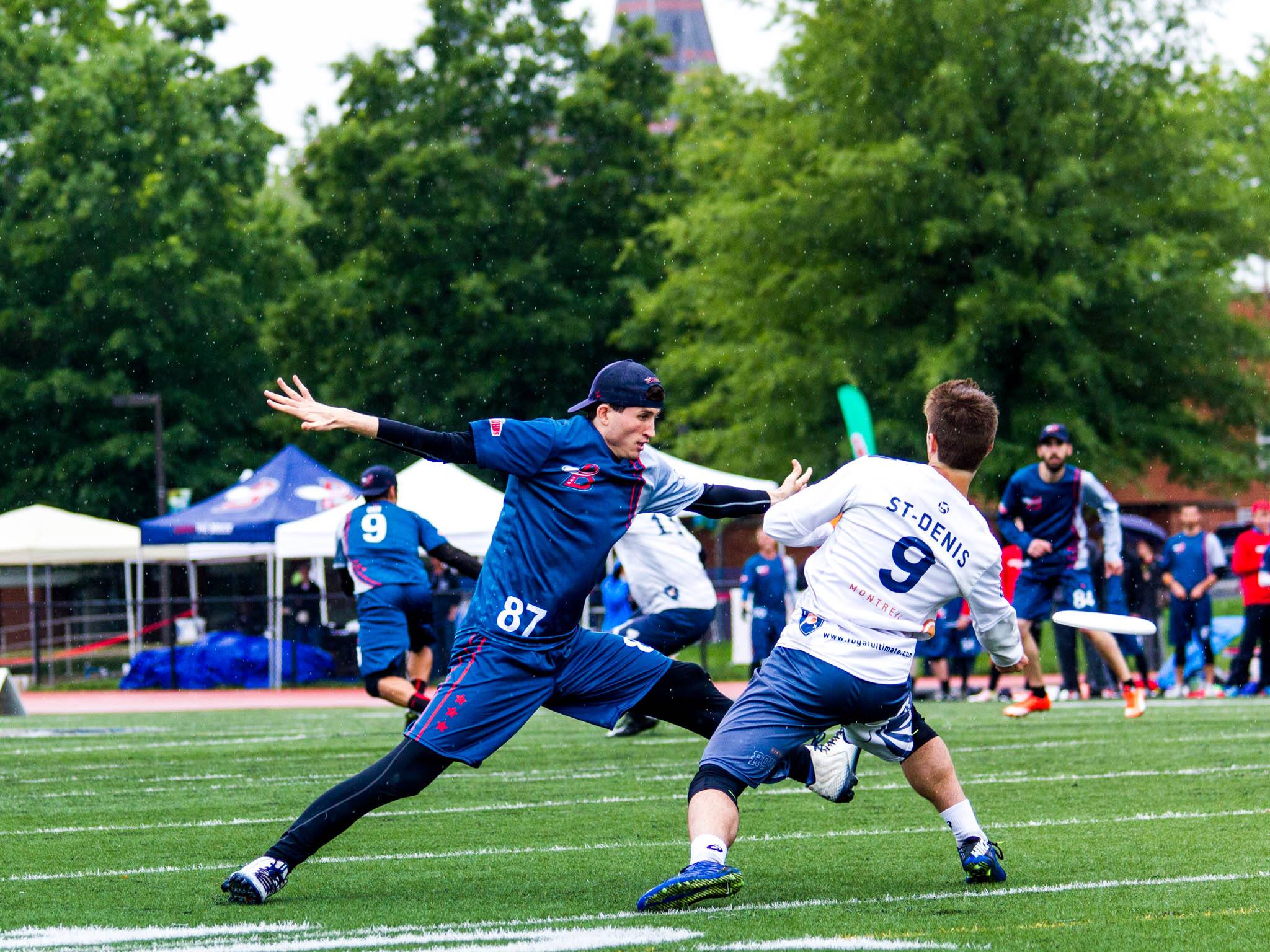
I do like these. They are a little bit much, with a whole back of lightly sublimated stars, and I think even on the front, judging by this photo of the road kit. But it’s not obnoxious by any means. And the shorts! These are some of my favorite shorts in the AUDL. There are two red lines that run down the left side (player’s left) of the jersey and the right side of the shorts. It’s not a straight line. It looks like a visual representation of the “breeze.” And on the shorts, 3 red stars complete the DC flag. Sweetly subtle. Again, DC. Red, white, blue. Very appropriate. Can’t go wrong.
Detroit Mechanix
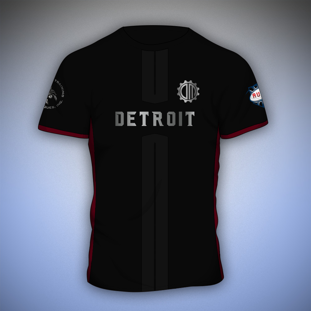
Okay, I honestly didn’t expect much from Motor City. Their logo always disappointed me a little bit and they’re really not that impressive as a team. But...that said, I was caught off guard when I found that, I like these! I don’t love the use of metallics on uniforms, but it’s Detroit! The home kit is a good nod to the city’s industry without being obnoxious. Same for the road kit. I dig the stripes, and I like that it remains a gray and white jersey with some badass blood-red underarm accents. Well played, Detroit.
Indianapolis Alley Cats
As one of the only teams sporting true green, the Alley Cats are definitely different. I can’t totally get behind the logo. It seems like a little much, but other than that, the jerseys are refreshingly simplistic, featuring their full logo and player numbers on the front. Their home jersey looks like a classic t-shirt, white collar and cuffs, and the road kit is another classic t-shirt. A good ol’ raglan. I like it, and I hate to say it, but this kind of simplicity definitely stands out in the Ultimate uni-verse.
Jacksonville Cannons
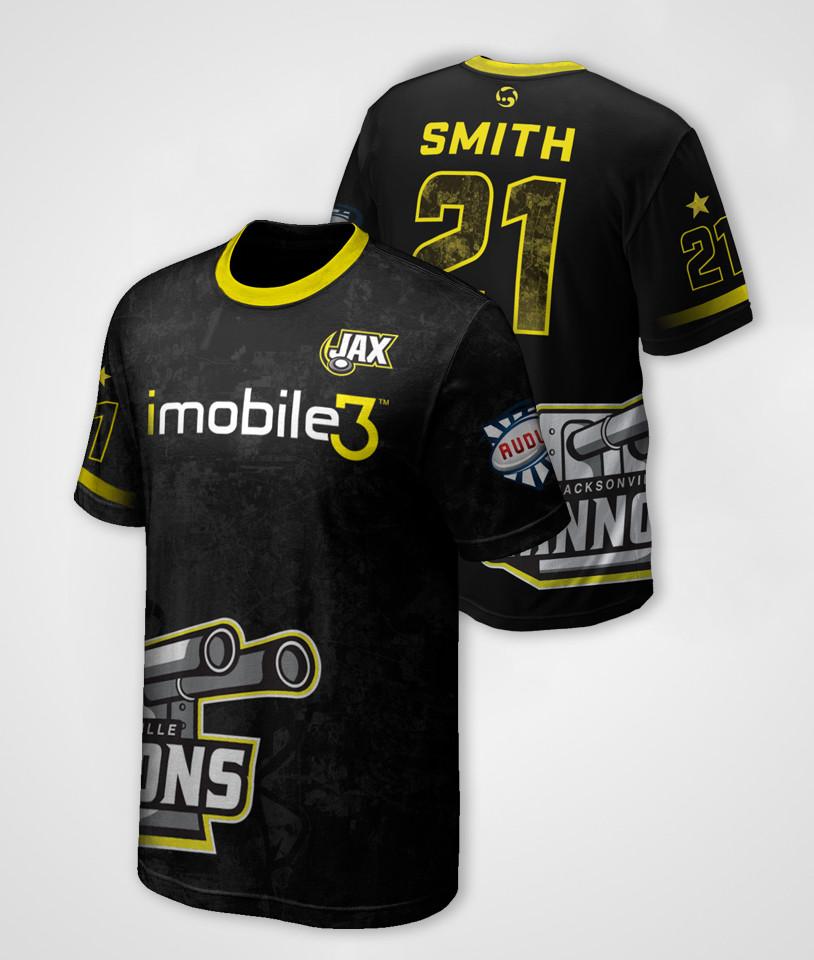
Alright! This is my hometown team! I do favor them in gameplay, but I will not spare any complaints over this misdemeanor of a uniform. I really want to like these, and it’s hard to pinpoint why I don’t, but I’ll start with the collars and cuffs. The road kit features a black collar-cuffs combo. And it’s cool. So why does the home kit only get half of one yellow cuff?! It fades out under the arm for some reason. The road jersey features the Cannons’ primary logo front and center. Boom. That’s it. The home jersey, however, features the team's sponsor front and center. Fine. But wait! They just moved the primary logo to the side. That is the most awkward place to stamp your big clunky logo, Jax. But that wasn’t enough, so the little secondary “Jax” mark gets a chest appearance. It’s too much.
Here comes my favorite part…
If you found yourself squinting and trying to make out some pattern over the entire jersey, you aren’t crazy. It’s there. That pattern, ladies and gentlemen, is a Satellite image of Jacksonville. At one point, I thought it was just the inside of the numbers on the back. I thought, “Cool touch.” Nope, It’s the whole damn thing. This is the danger of sublimation. With great power comes great responsibility. It’s just way too much, Jax. I yell because I care. Clean it up.
Los Angeles Aviators
Thank you, Aviators, for restoring peace to the uni-verse. I love these. Red and black is iffy for me, but that home jersey is just the right combination of simple and interesting. Good bold font. Good size. The full-jersey “A” symbol is really cool on the home and away kits. It appears that the same shorts are worn at home and on the road, but I think that actually makes a lot of sense for them. LA is full of good uniforms and this one is no exception.
Madison Radicals
This may just be my favorite uniform set. I’m usually not a fan of gradient use on uniforms, but something about the Radicals’ colors makes it a really solid design. And that logo is really powerful. I love the navy shorts to compliment the blue-to-acid green jersey. It’s killer. I am also a huge fan of white on white. So the road kit rocks. A big blue strike makes room on the sleeve for a big white TV number. The Radicals’ colors are just off enough to make them look really unique. No complaints.
I take that back. This hat is my one complaint. The design goes on the crown. Only the crown. This looks like an accident. Clean it up.
Minnesota Wind Chill
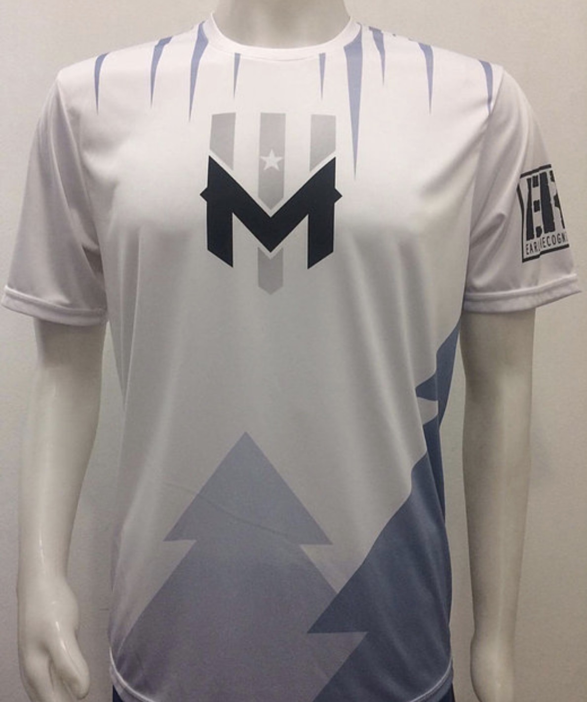
I can’t say I feel all that strongly about these. I used to, because the Wind Chill’s home jersey used to be a lot cooler. The overall composition of the home jersey is still pretty decent, but that gray is weirdly blue. The home jersey used to be the three lines in the logo going down the jersey off-center, and the M was placed on top of them at chest-height. Number on front was pretty much the same placement. There were no weird half pinstripes. I don’t know, I just liked that better. #bringitback
On the other hand, this road jersey is too much and too little at the same time. For how much is going on on this jersey, it lacks detail. I like too preach simplicity, so I’m sorry to say I don’t like it. I wish they would try writing “Minnesota" or "Wind Chill" on it somewhere instead of pasting the logo front and center. There’s a lot of opportunity in black, grey, and white. Keep at it, Minnesota.
Montréal Royal
This is another personal favorite. Nothing says “Royal” like a sash across the chest. Muted navy and orange look great together and navy all the way down looks great. The crest on the home kit makes it look like a soccer jersey, but somehow better! Montréal’s wordmark is cool, so the away kit is also quite good. White jerseys with navy shorts was a good call. Sometimes white on white doesn’t work out. My only complaint is that bird. I like that bird, but I wish they would remove it from the side of the away jersey. It’s not awful now, I just think it would be cleaner and more consistent sans bird.
Nashville Nightwatch
Okay, so the home kit is decent. All black would have been too much, so the gray pattern is a nice addition. Otherwise they kinda just plopped their primary logo right on the middle of the jersey. But it’s a good logo (definitely an improvement over their old logo), so whatever. On the other hand, their road kit. I saw the Nightwatch when they played my Cannons in Jacksonville on opening day, and I found myself gawking over these. What a good looking road jersey. White, with a subtle gray “Nashville” placed above a bold, red, “Nightwatch.” And shorts to match. Great front number placement and size and font. It’s simple and beautiful and I love it. If only they got the credit they deserved by winning, say, a single game. The Nightwatch are 0-14.
New York Empire
The home jersey used to be a bona fide tragedy. The New York City skyline was raised up from hem to chest in black, gray, and lime green. “Empire” graced the front above the buildings. It was bad. This is good. They shed the cartoon New York and replaced it with a simple “Empire.” Brilliant. And above that, but not too high, player numbers and the crest make their subtle appearance. Great font for the number on back of that home jersey. Very blue jays. I do though, wish they used the same number font at home and on the road. Probably the one from the road kit if I had to choose, since it’s the one that would look cool on both. The away kit is equally awesome. Simple and classic, as is New York’s specialty. I can’t say I’m generally a fan of pinstripes ever, but it’s very John Lennon and very Yankees and I respect that.
Ottawa Outlaws
So the home and away kits are pretty much the same, save for the color tweaking. So my complaints will cover both. The whole jersey looks like an adaptation of a Microsoft Powerpoint template with a big-ass horse head. I don’t mind the horse head as a logo, but I don’t think it should get such a big presence on the jersey. I don’t know where the horse should go…not there. Just...I don’t know. It looks very fabricated and lazy. That should cover it.
Philadelphia Phoenix
Okay, we made it to my least favorite set of jerseys. It is my least favorite set of jerseys because it perfectly showcases the gravity of the mistakes that can be made through sublimation. On the home jersey, a fire burns from the bottom of the jersey to the top. The Phoenix’s word mark, in a font reminiscent of a comic book, appears on the chest. It’s an okay logo. All in all, whatever. The home kit’s not great. But is nowhere near as bad as the road kit seen on the right. The road kit features a giant cartoon phoenix, rising above the Philadelphia skyline, emitting pinkish-red rays to the edges of the jersey. The logo is placed on the chest again. The sleeves, despite the torso train-wreck, remain untouched. It just looks too cheesy, even for a town known for its cheesesteaks. I love Philadelphia. It’s a beautiful city, all decked out in red, white and blue. And its sports teams are no exceptions. At least the Phillies and the Sixers aren’t. So you can sense my frustration with a team dressed as tackily as the Phoenix.
Pittsburgh Thunderbirds
Pittsburgh! Pittsburgh. I love this city. Pittsburgh is known for its sports, and Pittsburgh’s sports are known for being so very Pittsburgh. So, naturally, the Thunderbirds followed suit. Unlike the Phoenix, the T-birds embraced the hometown colors, the distinctive yellow and black worn by the Penguins, Steelers, and Pirates. Good for you, T-birds. Other than that, I think the jerseys are rather unexciting. The logo is good, but it’s nothing special, so its chest presence doesn’t add much to the kits. This is what most college ultimate jerseys look like. The jersey is pretty much the same home and away. One black, one white. What is yellow remains yellow on both. Overall, can’t complain. They’re not awful. They just don’t stand out to me.
Raleigh Flyers
The Raleigh Flyers are an excellent team, going 13-1 so far this season. They beat my cannons twice by only a point this season. I can look past that enough to say that I do like their kits. The home kit is especially cool. The bright red and light blue is a killer color combo, and the logo is really cool too. I would venture to say it could maybe be a tad larger on the chest. The blue portion of the left sleeve is the Raleigh skyline, which I definitely looks better on the sleeve than on the butt of the away jersey. The front of the away jersey features the same Flyers’ logo as the home kit, just on white. Additional thoughts on these kits: I think it looks great when players wear blue socks, especially light blue. And I like the white shorts, but I really don’t think the “R” logo needs to be that big. Keep it subtle.
San Diego Growlers
The Growlers mascot, though it shows no appearance on the jerseys, is a greyhound. The Growlers’ did a beautiful job on their home jerseys of acknowledging this, giving the whole kit a brown-infused-gray color. It looks really sweet. The red band across the chest accentuates the team name quite nicely. The “Growlers” is bold and easy to read and it looks great. I love the cuffs in red. And the hems of the shorts. That’s subtlety done right. The away jersey. Same deal. Same red band. Same red cuffs. Same font. Glad they kept the gray shorts. All around solid look. Go San Diego.
San Fransisco Flame Throwers
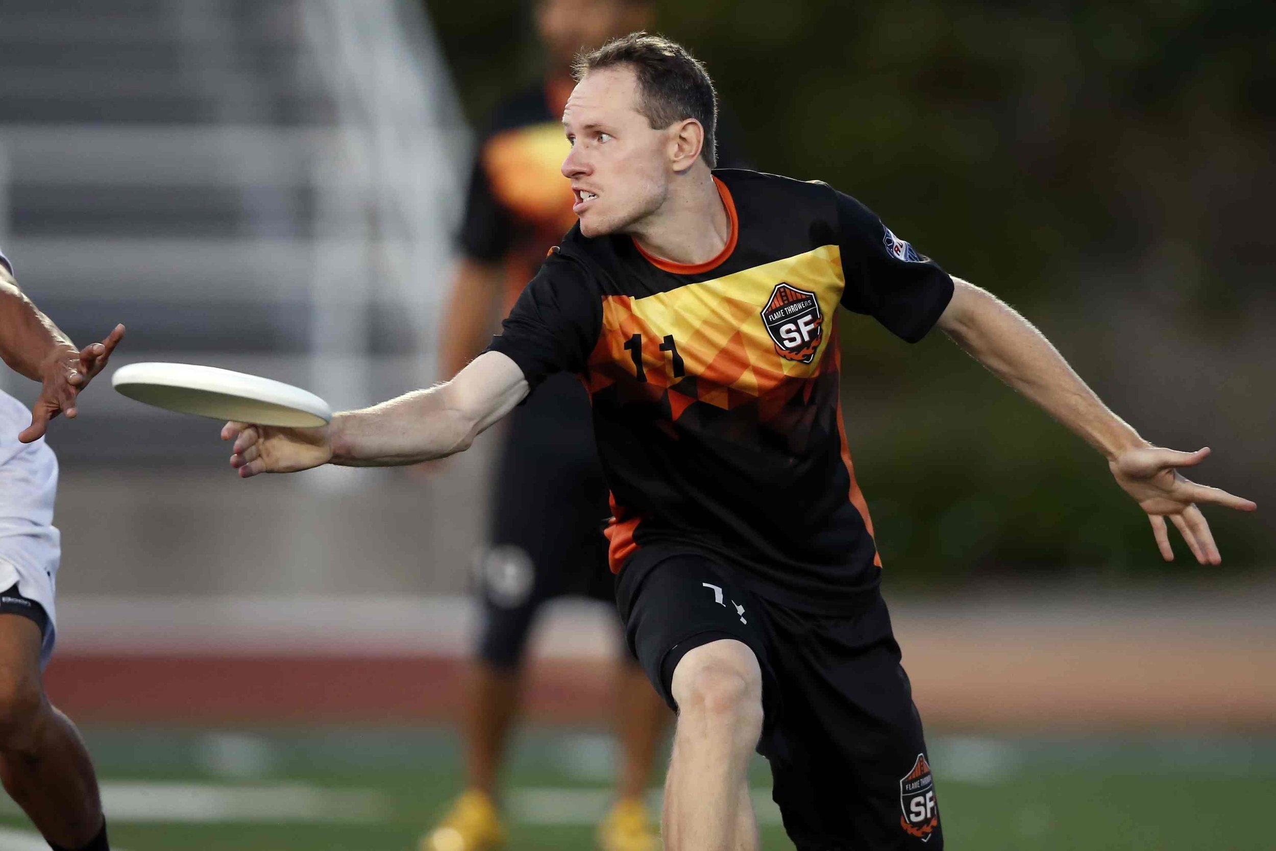
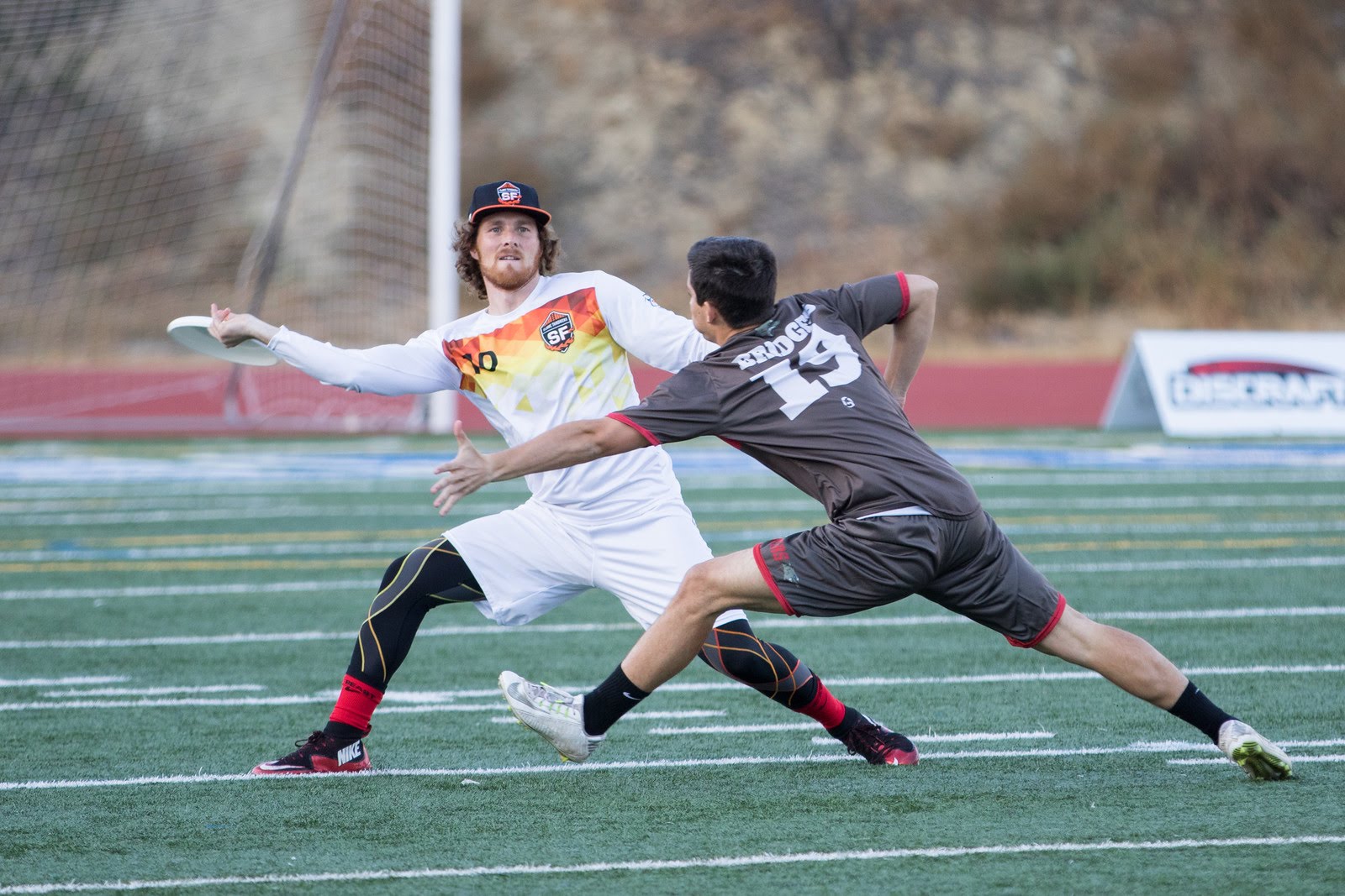
Hey Philly! San Fransisco figured it out. This is how you do fire. I love these jerseys. These are in my top 3, league-wide. The geometric fire pattern that burns on the chest is simple, but equally exciting. The bottom of the jerseys remain blank, which looks so good. The away kit is the a best case scenario of white on white, and for that matter, the home kit is the best case scenario for black on black. The seal on the chest is a strong one, and player numbers are emblazoned on the chest in Helvetica. Simple. Bold. All around great look. Well done, San Fransisco. It’s a masterpiece.
San Jose Spiders
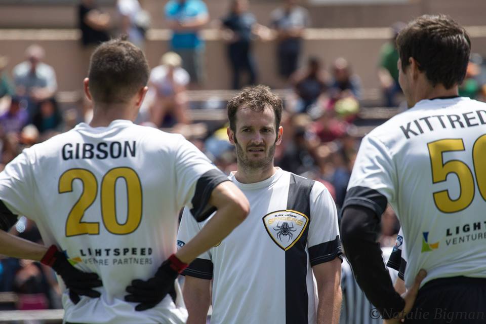
Another solid look. The spider in their logo has a sort of robotic look to it, and the “Spiders” font reflects that. So the shield shape being a little different goes right along with their branding. It makes sense. The home kit. One yellow stripe. Black on black. Simple numbering. Sweet. Looks strong. Away jersey is an adaptation of the home kit, so same same. Looks good. A strong team with a strong look. Nice work, Spiders.
Seattle Cascades
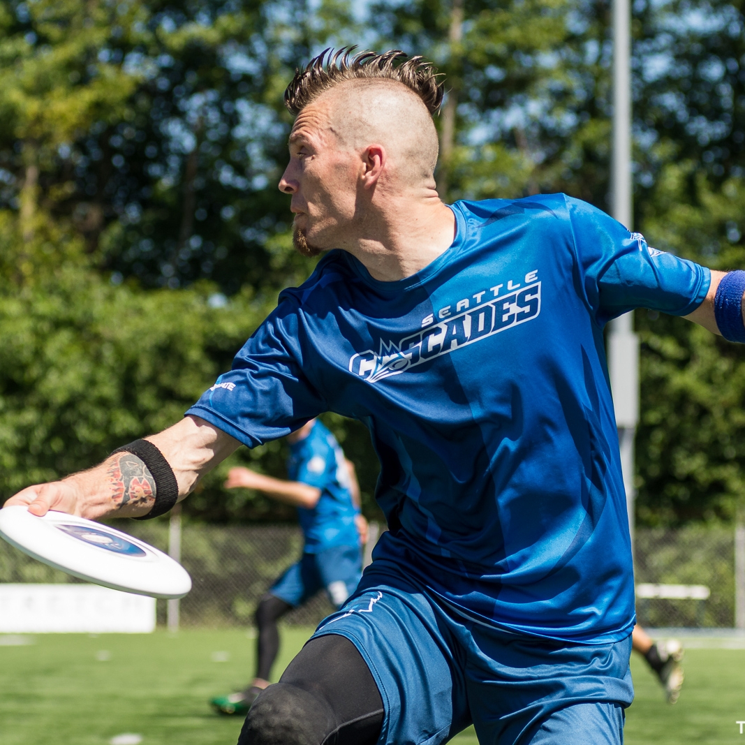
This is another favorite of mine. The two tone blue jersey is just barely noticeable from a distance, but it really adds to the jersey. The Cascades’ word mark is a good one. It’s presence on the home chest makes for an ideal look. It’s the perfect combination of sublimation’s capabilities and a sense of simplicity. I dig it. The away jersey is alright. I think “Seattle” is a little too wide to be pasted so high up and directly above Casey the Sasquatch. That said, I love the Casey logo. I love that Sasquatch is the visual representation for the Cascades. The blue side and shoulder accents come from the pattern of Casey’s fur. Which is cool. Apart from a slight problem with composition on the away jersey, I think the Cascades look good. It’s a well-constructed set of uniforms.
Toronto Rush
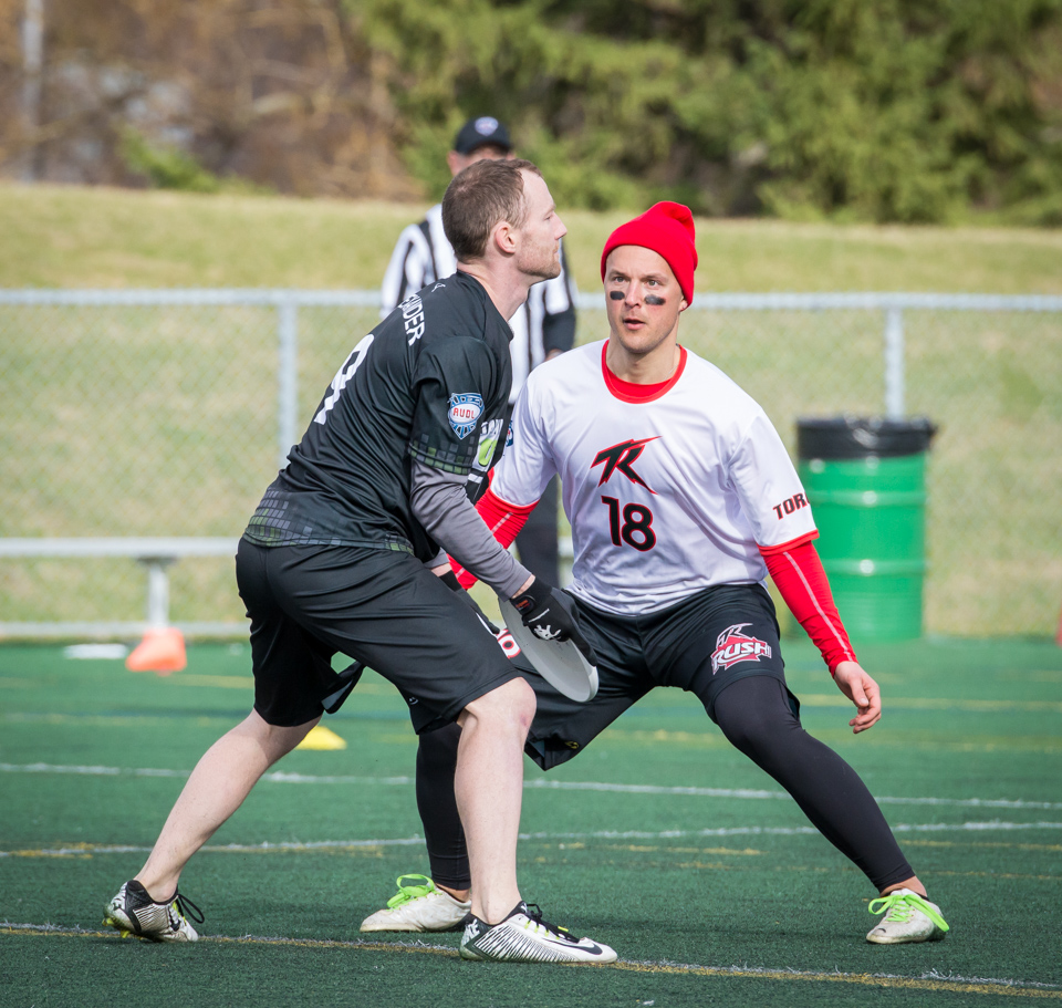
Toronto is home to Canada’s second pro ultimate team. While I think it is appropriate that Montreal’s team gets that navy-and-orange, European look, I’m glad that one team chose to wear red. However, I can’t say that I love their look. The home jersey is just a tad too much. I think the “TR” logo is okay, but I don’t like the “rush” logo hardly at all. It’s too early 2000s. It looks too much like an energy drink logo. I think the weird gold bursts are weird. However, I do like the away jersey. I wish there were red shorts to go with it, but I think the small “TR” logo looks nice on the white, with a reasonably sized front number below it. The away look is better, but that wasn’t a feat by any means. There’s work to be done here, Toronto, but it’s possible. Get rid of your energy drink logo. Try and use that amazing national flag to your advantage. I’ll be back to check on you in a few years.
Vancouver Riptide
And finally, The Vancouver Riptide. The Riptide is Canada’s third team, but Vancouver is basically part of the Pacific Northwest, so the blue and green seems appropriate. And boy does it look good on you, Riptide. These kits, with their vertical, woven striping, are reminiscent of a soccer team, or maybe even basketball in a way. The “Riptide” word mark is really solid, and so is the logo, so I’m glad they both show up on the home kit. “Riptide” is placed sensibly on the chest, perpendicular to the striping, and the logo is placed on the shorts. (This is a good size for a shorts logo, Raleigh) A different weaving pattern crosses the chest of the road jersey, and is equally good-looking. A blue vertical stripe runs down the sleeve and side and becomes the blue shorts. Good job there. Can’t say too much, Vancouver. You look good.
So you see what I mean. Ultimate uniforms are pretty cool when designed appropriately. They're probably closer to soccer that anything, but they are in a way becoming a uniform style in and of themselves. The patterns and the lightweight clothing and the presence of sublimation are all characteristic of the ultimate uni-verse. Sublimation is providing a platform for betterment and advancement of uniforms, but really is a tool that must be handled with care and respect.
That's the whole field of AUDL uniforms for the 2017 season, and that’s all I have to say about that. Overall, I think the ultimate uni-verse could use some work, but it’s definitely a good sign that there are teams like Seattle and San Fransisco and San Diego pushing it in the right direction. Be sure to watch out for these teams in the coming month, as we approach Championship Weekend in Montreal, August 26-27.
